TIM YOUD
“I’m not a purist, but at the same time I feel strongly the pull of formalism... my sweet spot sits in the tension of the transformation of one thing turning into another.”
Interview by Amanda Quinn Olivar, Editor
A performance and visual artist, Tim Youd is presently engaged in the retyping of 100 novels over a ten-year period. To date, he has retyped 61 novels at various locations in the United States and Europe. He has been in residence at various historic writers’ homes, including William Faulkner’s Rowan Oak with the University of Mississippi Art Museum (Oxford, MS), Flannery O’Connor’s Andalusia with SCAD (Milledgeville and Savannah, GA), and Virginia Woolf’s Monk’s House (Rodmell, Sussex). His work has been the subject of numerous museum exhibitions, including The Contemporary Art Museum St. Louis, The Frances Lehman Loeb Art Center, The New Orleans Museum of Art, Monterey Museum of Art, Hemingway-Pfeffer Museum, Museum of Contemporary Art San Diego, University of Mississippi Art Museum at Rowan Oak, and the Lancaster Museum of Art and History. He has presented and performed his 100 Novels project at Los Angeles Contemporary Exhibitions (LACE) and LAXART, and retyped Joe Orton’s Collected Plays at The Queen’s Theatre with MOCA London. He lives and works in Los Angeles (source: Cristin Tierney Gallery).
Amanda Quinn Olivar: To begin with... why do you make art?
Tim Youd: It really comes down to compulsion. I’m happy when I’m making art, and I’m not happy when I’m not. Not everyone likes that answer, I know. It lacks the notion that some type of higher calling is behind the motivation. And there are aesthetic and intellectual and spiritual dimensions to what I do. But those are almost incidental benefits, which is to say any work may be more or less successful in the face of a wide range of criteria. But it will be nothing if it’s not made in the first place. So, compulsion.
Amanda: The title of your drawing exhibit at there-there in Los Angeles is Drawings of A Painting. Is there a story behind the title?
Tim: Early on in my 100 Novels project, I began collecting used typewriter ribbon. At first, I was just saving the ribbons I myself used. Then I started accumulating boxes of used ribbons from typewriter repair shops, knowing there was something exciting hiding in these things. I made my first works with these ribbons for a 2015 solo show at the New Orleans Museum of Art, which ran concurrent with a series of typing performances in Louisiana. In the last year, I began a second series of typewriter ribbon paintings, again utilizing these boxes of discarded ribbon.
During the course of making these paintings, which have a geometic form, I decided to draw one. I thought the drawing might allow me to further focus on the typewriter ribbon as a thing itself. And out of that initial impulse has come quite a number of drawings, and the urge to make these seems far from abated. The show at there-there features one of the Typewriter Ribbon Paintings, and sixteen drawings. The correspondence between the painting and the drawings is not one of slavish exactitude. Rather, the rectangle within the rectangle format is present in them all; there is an identifiable pallete to the body of work, and the typewriter ribbon motif recurs throughout. But there is a variety in the individual designs.

‘Typewriter Ribbon Painting (Series 2) XL - No. 1’, 2019, oil and typewriter ribbon on panel, 48 x 36 inches (121.9 x 91.4 cm)
Amanda: How would you describe your work and subject matter?
Tim: At the core of my work is the close reading and retyping of the 100 novels. I see the close reading as a type of devotion. I’m attempting to be the best reader I can be, and to arrive at as thorough an understanding of the subject novel as I can.
Out of these retypings, I’ve found the subject for multiple bodies of studio work. For example, I did a series of paintings from my point of view at the typewriter, which turns into these huge arms reaching out and diminishing as they go until a pair of small hands come to rest on a diminished typewriter. This past year, during a performance I was doing in the Hudson Valley, a viewer who observed me said it seemed as if I was eating the book. When I got back to my studio in LA, I did a series of works around the idea of me swallowing a book whole. I’ve also made large-scale sculptures of the typewriters themselves. Because I do each retyping on the same make/model typewriter used by the author, I gain a specific awareness of the machines I’ve used. Translating this focus into these solid yet whimsical sculptures has been a highlight. And then of course there is the focus on the formal quality of the page itself. I retype the entire novel on a single page, backed by a second sheet, in an attempt to emphasize the formal rectangle within a rectangle quality of the page. That formal quality has filtered through the Typewriter Ribbon Paintings, and now into this new series of drawings.

‘Charles Bukowski's Underwood Champion’, 2013, mixed media, approximately 30 x 36 x 12 inches. Photo credit: Joshua White/JWPictures.com

‘Charles Bukowski's Underwood Champion’ (detail), 2013, mixed media, approx. 30 x 36 x 12 inches. Photo credit: Joshua White/JWPictures.com
Amanda: Was there a specific moment or impetus that led to your current series?
Tim: I’ve been making the Typewriter Ribbon Paintings, with some interruptions, since 2015. Because I’ve had a break from any performance work since September, I’ve been able to dive deeply back into these paintings these past eight or nine months. The extended focus led me to see the typewriter ribbon itself more clearly, and the drawings came out of a desire to distill that motif in a stark manner. For me, that meant drawing it.

‘Drawing of a Painting Large - No. 2’, 2019, colored pencil and graphite on paper, 40 x 32 inches (101.6 x 81.3 cm)
Amanda: Please tell us the ideology behind your practice... Are you exploring personal experiences?
Tim: I don’t know if I have an ideology. But I do have a lifelong deep connection to reading. It seems like a funny thing to build an entire life’s work around, but I can say that once I was able to connect my visual art with my interest in reading, a lot of good things happened for me. This probably goes back to my answer to the first question, about why I make art, to which I answered it was a compulsion. I’d say it’s the same with my reading. It’s kind of a compulsion. I can’t really just sit, I need a book in my hands.
Amanda: Did your upbringing and early life in in Massachusetts influence the direction of your work?
Tim: My mom was and still is an artist. She strapped a drawing board to my highchair and had me drawing before I could walk or talk. My dad was a child psychologist, and he had a collection of books that I recall browsing from my earliest years. They were physical things before they were volumes of abstractions. From the outset, I was surrounded with the things that are now at the core of my art. Maybe the entire exercise is a retreat into childhood.
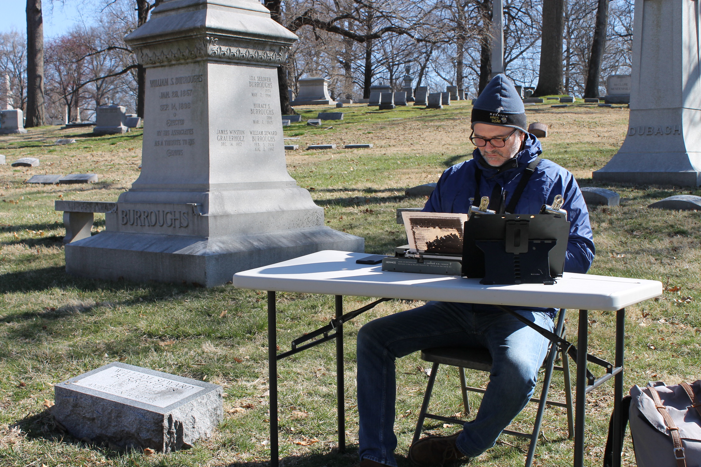
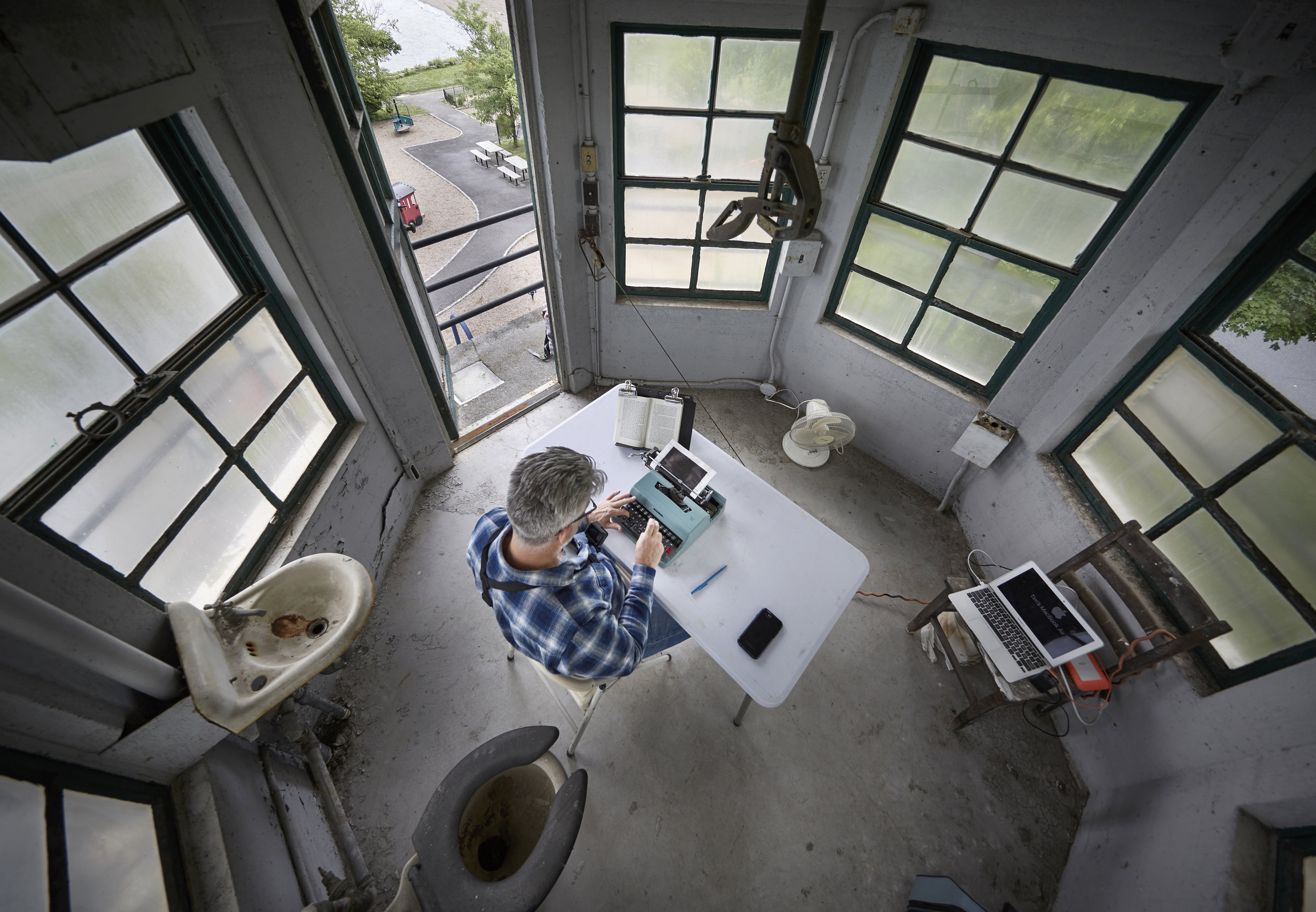
Tim Youd retyping William S. Burroughs’s ‘Naked Lunch’; 196 pages typed on an Hermes Rocket (Burroughs’s childhood home, Left Bank Books, and Bellefontaine Cemetery, St. Louis, MO, March 2018)

‘William S. Burroughs's Naked Lunch’, 2018, typewriter ink on paper, framed: 17 x 25 inches (43.2 x 63.5 cm). 196 pages typed on a Hermes Rocket (Burroughs's childhood home, Left Bank Books, and Bellefontaine Cemetery, St. Louis, MO, March 2018)
Amanda: After receiving your degree in Economics from the College of the Holy Cross, what took you to Los Angeles?
Tim: Upon graduating, I moved to New York for a job on Wall Street at an investment bank. Not very arty, I know. After a two-year program at the bank, I left for Los Angeles to produce movies. That’s slightly more arty on paper, but no more arty in reality. By the time I was thirty, I was deeply unhappy. Motivated by some subconscious urge, I reached for a drawing pencil and started making art for the first time in years. Almost immediately, I knew I needed to be making art full time. Easier said than done, but I found a way. And I also discovered Los Angeles to be a far more nuanced place once I started making art, than it was when all I was trying to do was be successful. So I stayed, and got married and had kids and dogs and cats and rabbits (dead now) and fish (also all dead) and a lizard (still alive).
Amanda: Talk about your technique and materials… How do you approach your space, and what roles do color and form play?
Tim: I’m not a purist, but at the same time I feel strongly the pull of formalism. For example, it’s a pretty whimsical or maybe even ersatz notion to sit at a typewriter in a parking lot copying someone else’s novel. But in the retyping, I put it all on one sheet of paper, giving physical weight to the accumulation of the words, and giving emphasis to the very formal design of the rectangle within the rectangle. Extrapolating from that, and applying it to the current show, I’ve taken a typewriter ribbon, which was manufactured as a functional and disposable commodity, and found in it this elemental red and black abstract unit upon which to build a series of drawings. This is probably a roundabout way of saying that my sweet spot sits in the tension of the transformation of one thing turning into another.
Amanda: Is there a story behind Drawing of a Painting: Large – No. 1? Tell us the evolution of your process… from conception to end.
Tim: This piece was the first one I did at this larger scale. I’d made a few at 17"x14" and a few at 24"x19", and I knew I wanted to get bigger. So there is that for starters. I should step back and say I haven’t done much art work with colored pencils. During the course of making the first few pieces of the smaller dimensions, I took a few trips to Blick to pick out some pencils. It was really then that I started to see colored pencils for the first time, because for the first time I really had a need and a desire for them. I was testing various reds and blacks, and also various flesh-like tones. The red and black was for the typewriter ribbon, and the flesh tones were for the person, the human. I pulled out this Prismacolor Nectar and tested it on a scrap of paper. It went on like butter. Or like my wife’s flesh-tone makeup pencil I’ve used to blot out a pimple on the night of an opening. Either way, I loved it, and bought all they had in stock. When I finished the drawing, I was down to the nub of my last Nectar pencil, and Blick didn’t get more in stock for another week. So I just made it.

‘Drawing of a Painting Large No. 1’, 2019, colored pencil and graphite on paper, 40 x 32 inches (101.6 x 81.3 cm)
Amanda: You’ve been performing your 100 Novels project for over a decade, and have re-typed over 61 books. How did the idea come about? Do you have a favorite novel, location and experience over the years?
Tim: The epiphany occurred in my studio, years ago, while I was reading a book. I recognized that, on a formal level, what I’d been looking at for all these years was a rectangle of black text inside the larger rectangle of the white page. I remember taking the book between my hands and pushing, having this palpable urge to crush all the words onto one page. And that’s really what I’ve done. I’ve treated the words as physical things, and have accumulated them to the point they have texture and weight and density. I see the end result—the blotted and distressed diptych—as a metaphor for what happens when we read. We don’t have a recall of the entire text in legible form. We have an illegible impression that has physically marked our brains.
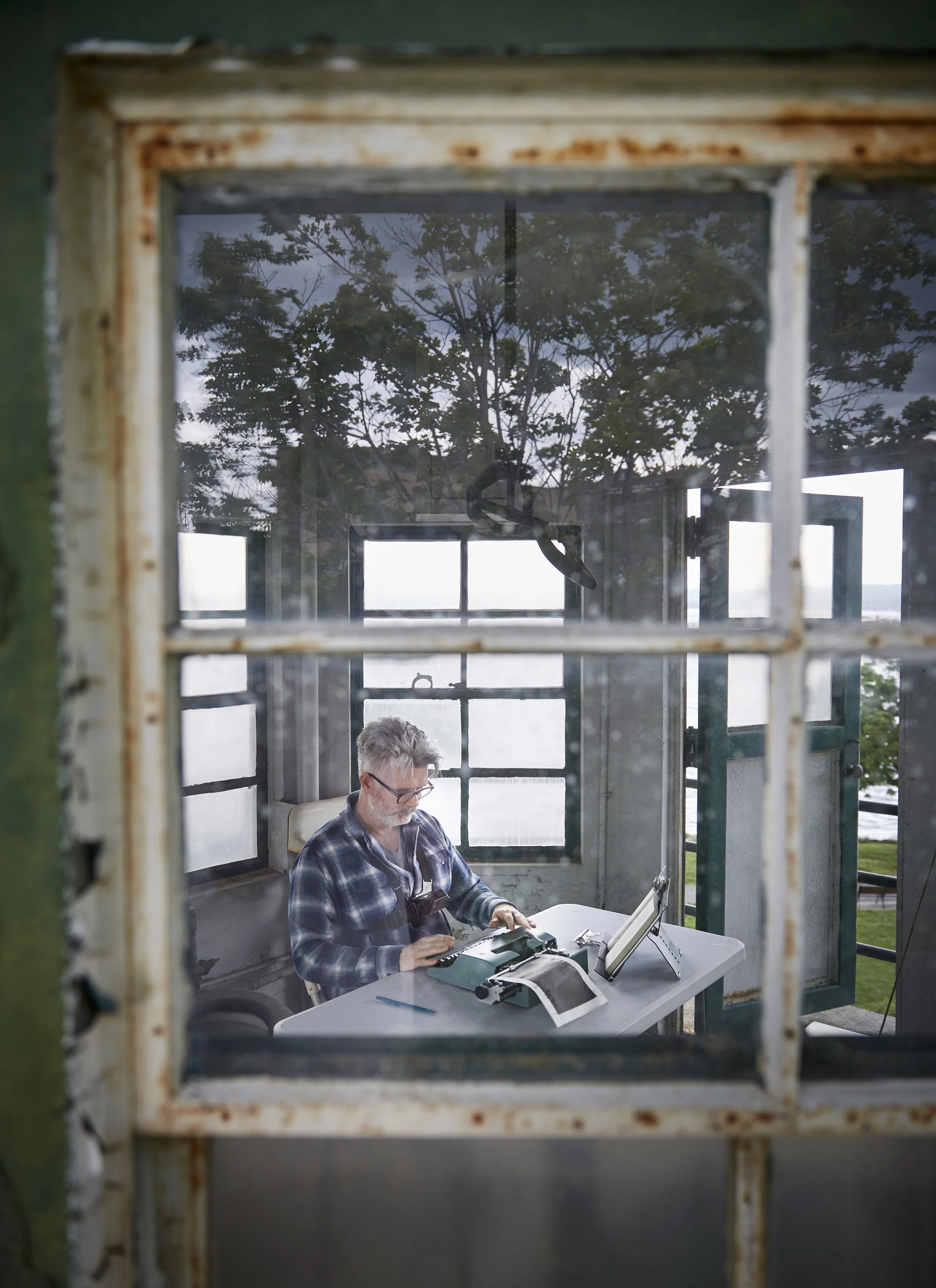
Tim Youd retyping John Cheever’s ‘Falconer’; 211 pages typed on an Olivetti Lettera 32 (decommissioned guard tower at Sing Sing Prison, Ossining, NY, June 2018). Photo credit: John Muggenborg.

‘John Cheever's Falconer’, 2018, typewriter ink on paper, framed: 17 x 25 inches (43.2 x 63.5 cm); 211 pages typed on an Olivetti Lettera 32 (decommissioned guard tower at Sing Sing Prison, Ossining, NY, June 2018)
Amanda: You’re starting a new adventure… Tell us about your project for MOCA Tuscon, Retyping Arizona.
Tim: From early on in my 100 Novels project, I’ve known I wanted to do an Arizona cycle. There are some great works of literature associated with the state and a number of them are pretty big books, just in terms of pages. DeLillo’s Underworld is over 800 pages. That’s going to be close to two straight months of typing, which will be almost double my longest effort so far. That sounds painful, which means it’s bound to be worthwhile.
I was introduced to Ginger Porcella, who is the director of MOCA Tucson, by my friend Josh White, who is one of the very best photographers of art and architecture. It turns out Ginger had seen my solo show at the MCA San Diego a few years earlier, and was in the early stages of planning a text-based exhibition at MOCA Tucson for the fall of 2020. So she offered me a solo show to compliment the exhibition she was doing, and we decided to have me start with the performances this spring. So here I go.
Amanda: What is most important to you about the visual experiences you create? And are you interested in what your audiences take away?
Tim: If I have my druthers, I’d just as soon someone have a positive experience with me and my art. I work hard at what I do, and I think my art holds up on aesthetic and conceptual and spiritual levels. But I’m not set on programming someone’s response or experience. That sounds more like a theme park.
Amanda: Please relate a memory that influenced or changed your artistic outlook.
Tim: My wife and I have five kids. Our two youngest are girls, who are only a year apart. I recall when they were in the toddler stage, and asking lots of existential questions the way toddlers do. They wanted to know what I did, was I happy, was I good at what I did, and so on. This was at the same time I was trying to navigate my way clear of being a businessman and into being a full-time artist. I had a moment of clarity where I saw that I could answer my kids with more honesty if I was the full-time artist I was meant to be, rather than some unhappy clown of a businessman. That clarity helped me immensely, as it gave me the conviction to take the leap I needed to take.
Amanda: What is your favorite art accident?
Tim: My first public retyping performance was of Henry Miller’s Tropic of Capricorn, which is Miller’s Brooklyn novel. I was set up at a small table on Metropolitan Avenue in Brooklyn, around the corner from Miller’s boyhood home. I’d been typing every day for ten days or so, and had 32 pages or so to go, on what was to be my last day. I was adjusting my table, when I accidentally dumped the typewriter onto the sidewalk. It was a heavy Underwood desktop machine from the twenties. It flipped in such a way that it landed upside down on the register, thoroughly jamming it and rendering it useless. Needless to say, I couldn’t finish that day. When I got back to LA, I had the machine fixed. It would have been only a day of typing in my studio, but I decided there was a poetry to the accident, and I chose not to type the final 30 pages. That’s the only piece of the 61 to date I have not finished.
This exhibition has given me a new accident to add to the list. For a number of years now, I’ve been sending out a limited number of hand-typed postcard invitations for my various shows. I did two sets of 100 cards for the there-there show, which took a bit of work. On the back, I typed each recipient’s name and address in the block on the right hand side, which is designated just for that. And on the left, where one puts the message, I worded my invitation and noted the time, date and location of the exhibition. At least half of the postcards have been mailed directly to there-there as a result of the post office ignoring the address of the recipient in favor of the address of the gallery. No wonder the USPS is going out of business.

‘Drawings of a Painting’, installation view, 2019. Courtesy of there-there gallery.
Drawings of a Painting at there-there gallery, Los Angeles, May 16 - June 15, 2019
Retyping Arizona at the Museum of Contemporary Art Tucson, May 21 - May 30, 2019
Featured Image: Tim Youd retyping Jack Kerouac's ‘Big Sur’; 256 pages typed on an Underwood Universal (Bixby Bridge, Big Sur, CA, July 2015). Photo credit: John Muggenborg.